Rotaract Foundation Ball at The Theodore by Tre Luna
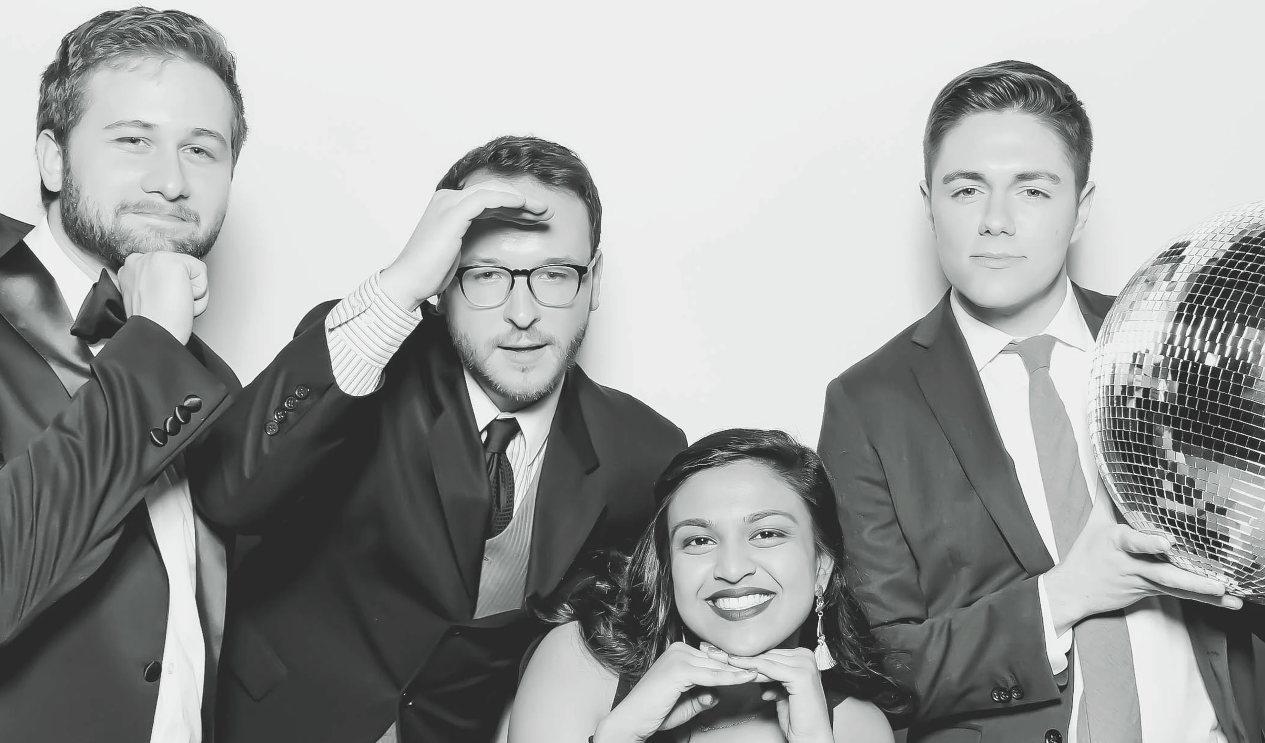
Can a photo booth belong at a black-tie fundraiser without making the room feel less polished?
The FlashBar created black-and-white portraits throughout the evening and printed them as large 5-by-7 metallic luster photographs. The result was not built around novelty props or a tiny souvenir strip. It was a portrait experience designed for the way guests were dressed and the reason they had gathered.
This one comes from the FlashBar archives, but the planning lesson is still current: when the photography, format and event agree with one another, a photo booth can add energy without lowering the tone.
The event celebrated Rotaract's community impact and supported three signature service projects: Achieve Alabama, Ready2Succeed and Ready2Read. The evening included live music, food and drinks, a VIP lounge, raffles and prizes.
The photo experience needed to feel at home inside that larger program, not compete with it.
Why black and white worked
Black-and-white photography was a natural fit for a black-tie room.
Guests arrived in formal clothing, but not in identical colors, fabrics or patterns. Removing color gave the portraits a more unified appearance and kept attention on faces, expressions and relationships.
It also separated the experience from the bright, novelty-driven look people often associate with event photo booths.
That does not mean every gala should choose black and white. A fundraising event built around bold brand colors, florals or a campaign installation may need full color. At Foundation Ball, the monochrome treatment supported the atmosphere without asking the event to redesign itself around the booth.
The decision began with the room and the guests, not a filter selected at random.
Why the 5-by-7 print mattered
A 5-by-7 photograph changes the way a guest experiences the result.
It gives a group portrait room to breathe. Faces remain visible, the image has presence and the event design does not have to squeeze into the edge of a narrow strip.
The metallic luster finish added depth and a subtle glow to the black-and-white photographs. Guests received something closer to a finished portrait than a receipt proving they had visited a booth.
That distinction matters at a gala. The people attending have dressed for the occasion, gathered around a cause and may not often be photographed together in that setting. A larger print respects the effort already present in the room.
Digital sharing offers reach and convenience. A physical portrait offers a different kind of memory. For Foundation Ball, the 5-by-7 print made the photograph part of the hospitality.
The booth did not need to become the theme
Foundation Ball already had an identity: 200 Years Young, tied to Alabama's Bicentennial celebration and Rotaract's work in the community.
The FlashBar did not need to invent a competing concept. The portrait treatment and paper choice were enough to make the experience specific to the evening.
This is useful for planners who feel pressure to customize every surface. A gala photo booth can belong to the event without covering the background, print and booth in repeating logos.
Start with these questions:
What are guests wearing?
What does the room already look like?
Should the finished photograph feel playful, editorial or formal?
Will guests value a digital image, a print or both?
Which event details truly need to appear on every photograph?
Good customization is not always more customization. Sometimes it is one confident photographic choice carried all the way through.
What this gala got right
The portrait style matched the dress code
Black-and-white photography complemented a formal audience instead of making guests feel like they had stepped into a different party.
The keepsake justified itself
The large metallic luster print gave guests a reason to care about the finished photograph after the event ended.
The experience supported the cause
The event remained centered on Rotaract's service projects and Birmingham's bicentennial celebration. The booth added a social experience without needing to become the main story.
The choices were easy to understand
Guests did not need a long explanation. Step in, make a polished portrait and leave with a finished print.
That clarity is valuable in a busy program with music, hospitality, raffles and fundraising activity already competing for attention.
Lessons for gala and corporate planners
The same principles can guide a nonprofit gala, awards dinner, client event or company celebration today.
Match the photograph to the room. Decide between full color and black and white after considering lighting, decor and wardrobe.
Choose the keepsake deliberately. If prints are included, select a size and paper that suit the quality of the portrait.
Let guests remain the subject. Branding should identify the event without overwhelming the people in the image.
Make participation obvious. Place the booth where guests can discover it without blocking the program, bar or service paths.
Protect the event timeline. Encourage portraits during social portions of the evening, not speeches, awards or appeals.
Confirm the practical details. Floor space, power, internet, load-in and queue planning still matter in a beautiful room.
The strongest photo experience often looks simple on event night because the important decisions were made well before guests arrived.
Could this approach work for a wedding?
Absolutely.
Black-and-white portraits and larger prints can work beautifully for an evening wedding, particularly when guests are dressed formally and the couple prefers a cleaner aesthetic.
The same approach could also suit an anniversary, museum event or employee awards dinner. The point is not to copy Foundation Ball exactly. It is to use the event itself as the creative brief.