How to Brand a Corporate Photo Booth Without Overdoing It
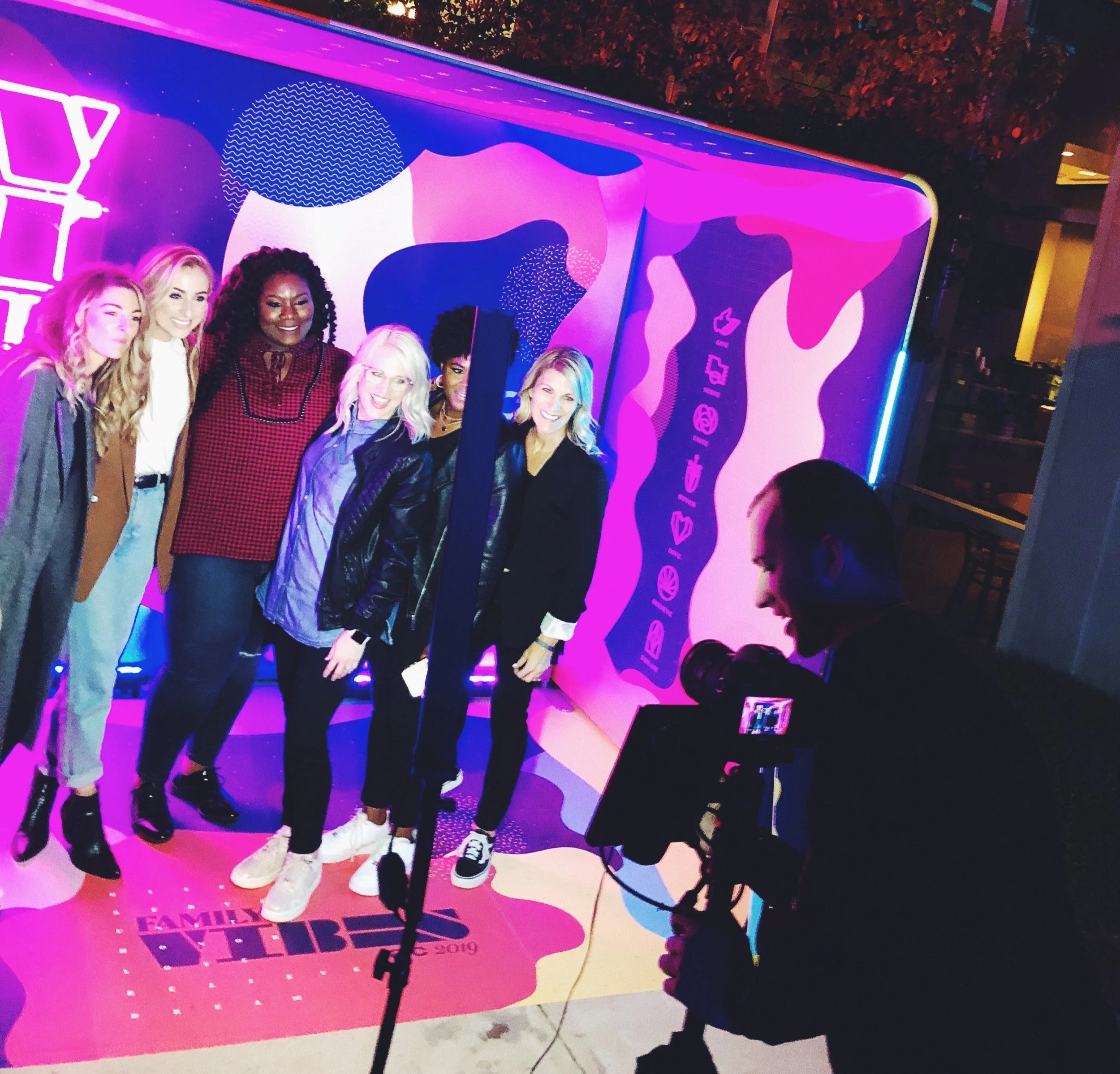
The best corporate photo booth starts with a portrait guests genuinely want, then adds the brand with intention.
That order matters.
If every surface is covered with a logo, the experience can feel like an advertisement guests are being asked to stand inside. If the branding is too generic, the booth may be attractive but disconnected from the reason everyone is there.
The middle ground is thoughtful and specific: flattering photography, a well-designed environment and a few brand elements placed where they have the most value.
For a company celebration, awards dinner, client event, fundraiser or product launch, that approach creates something more useful than a novelty. It gives guests an experience during the event and a finished image they may actually keep, post or use.
Here is how to build it.
Begin with the purpose of the event
Before choosing a backdrop or sending over a logo file, decide what the booth should help the event accomplish.
Different goals call for different creative choices.
Employee celebration
For an anniversary, awards night, team party or company holiday event, the booth should make employees feel recognized. The company identity can be present, but the people should remain the focus.
A refined print design, a date, the event name and colors drawn from the brand may be enough. Guests are more likely to share a portrait that feels like a photograph of their group than one that resembles an internal campaign poster.
Client appreciation event
For a client dinner, opening or hospitality event, the experience should feel generous. The goal is not to ask clients to advertise for the company. It is to give them something considered and memorable.
Prioritize beautiful lighting, attentive hosting and a setting that fits the room. Branding can appear on the finished print or in one carefully selected part of the set.
Fundraiser or gala
A gala may need to acknowledge a presenting organization and several sponsors without sacrificing the appearance of the photographs.
Establish a visual hierarchy. The event name or cause can lead, the presenting organization can follow and supporting sponsor recognition can be handled in a coordinated way. Trying to give every logo equal visual weight often produces a crowded result.
Product launch or brand activation
A launch can support a bolder concept because the brand or product is the reason for the gathering. Even here, guests need a reason to participate beyond standing beside a logo.
Use the product story, material, color, shape or campaign idea as creative direction. A custom environment inspired by the brand is usually more interesting than simply enlarging the logo.
Conference or networking event
At a conference, the booth can provide a social pause between sessions and a natural reason for colleagues to gather. The experience should be easy to understand and quick to use.
Consider whether guests would value a polished group portrait, an individual profile image or an event keepsake most. That answer should guide the crop, backdrop and finished design.
1. Put the brand where it will last
The finished photograph is often the most valuable place for branding.
A custom border can include the company mark, event name and date without competing with the people in the image. When a guest downloads the photograph or takes home a print, the event identity travels with it.
Keep the layout balanced. A smaller logo placed with confidence often feels more polished than a large logo filling every available corner.
For a gala, the print might include the event name and year. For a company anniversary, it might include a commemorative line. For a launch, it might borrow a shape or graphic element from the campaign.
The goal is recognition, not repetition.
2. Use the brand palette as an influence
Corporate colors do not have to be reproduced at full intensity across the entire setup.
One color might appear in the backdrop, another in the print design and a metallic accent in the surrounding decor. A neutral foundation can make strong brand colors feel more intentional and can keep clothing and skin tones from competing with the background.
This is especially helpful when the company's primary colors were developed for a screen or sign, not for a flattering portrait environment.
Ask what the brand should feel like, not only what color values appear in the style guide. Warm, precise, inventive, established and celebratory each suggest a different visual direction.
3. Design a setting instead of defaulting to a logo wall
A traditional step-and-repeat can be useful for press arrivals and sponsor visibility. It is not the only way to make an event recognizable.
A custom photo set can draw from the architecture of the venue, the company's materials, the campaign concept or the mood of the evening. Layered panels, dimensional details, furniture, florals or selected props can create context without overwhelming the portrait.
The FlashBar itself is handcrafted from Sapele mahogany with warm metal details. In a corporate ballroom, museum or historic Birmingham venue, it reads as part of the environment rather than a piece of generic event equipment.
That distinction matters when the event team has invested in the room. The booth should support the visual standard already established by the planner, designer and venue.
4. Make the guests the subject
Corporate events are still human events.
Employees want a photograph with the people who made a hard year manageable. Clients want a picture with friends or colleagues. Gala guests want to remember how they looked and who attended with them.
Give them space to be the subject.
Flattering light, a clean composition and helpful direction from a host create more value than a collection of random props. The experience can still be lively, but it does not need to turn every person into a character unrelated to the event.
This is one reason a portrait-style booth can work well for an elevated corporate audience. The photograph feels useful after the evening ends.
5. Choose color or black and white deliberately
Both can be right. They simply communicate differently.
Full-color portraits preserve the palette of a custom set, floral installation or branded environment. They may be the better choice when color is central to a launch or campaign.
Black-and-white portraits reduce visual noise and can give a mixed group of outfits, badges and background details a more cohesive look. They are often a strong fit for formal dinners, galas and evening celebrations.
Choose the treatment based on the event design and intended use of the photographs. Do not select black and white only because it is assumed to look expensive, or color only because the logo has a specific palette.
The FlashBar can create photographs in full color or black and white, allowing the creative decision to follow the event.
6. Offer a keepsake worth keeping
Digital sharing gives guests an immediate way to receive their photographs. Prints create a physical reminder of the event.
For some corporate programs, digital delivery is the cleanest choice. For an awards dinner, holiday party or client event, an optional 4-by-6 or 5-by-7 print may feel more like a gift.
The format should support the purpose. A small strip can feel casual and nostalgic. A larger portrait print gives more room for the photograph and creates a different impression.
The FlashBar offers digital sharing by QR code, with print options available for events that call for them. Metallic luster paper can add depth and a subtle sheen without relying on an oversized graphic treatment.
7. Give the event its own identity
The company logo does not have to carry the entire design.
An event-specific name, anniversary line, theme or date can make the photograph feel connected to one particular occasion. This is especially useful for annual galas and company celebrations, where the overall corporate identity stays the same but the event changes each year.
Examples might include:
The official event title and year
A short anniversary line
The name of an awards program
A campaign phrase already approved for the event
A city and date for a conference stop
A discreet presenting-sponsor credit
Keep the language short. Guests should be able to understand the finished design at a glance.
8. Recognize sponsors with restraint
Sponsor recognition is important, particularly at nonprofit events. It also requires disciplined design.
If several marks must appear on the photograph, use a consistent one-color treatment when brand permissions allow, provide enough clear space and follow an agreed hierarchy. If the sponsor list is too long for a clean print, consider whether some recognition belongs on surrounding event signage instead.
Do not promise every sponsor the largest logo. Decide the recognition structure before final artwork begins and make sure all required brand files are supplied in usable formats.
This is a practical conversation to have with the event organizer, designer and sponsorship lead early. It prevents rushed revisions and keeps the guest-facing image attractive.
9. Let the booth complement the room
The most successful installation considers what is already happening around it.
A mahogany booth may pair naturally with warm florals, candlelight, leather seating or brass accents. A white backdrop can provide a clean portrait field when the rest of the ballroom is visually active. A custom set can carry more of the concept when the surrounding venue is neutral.
Think about sightlines as well as colors. The booth should be visible enough to attract participation without interrupting the stage, awards program or main entrance.
For practical placement guidance, plan for approximately 10 feet by 10 feet on a solid, flat and level surface, with a dedicated standard electrical outlet nearby. Leave room for guests to gather without blocking the bar, registration area or service paths.